Dec 112018
 

Hard to believe but artist Jo Wong is already at work on the fourth installment of the ShadoWorlds Anthology series. The books are an unconnected series of individual books, each telling a an unrelated story of us mere mortals and our interactions with the hereafter, mythos, and legends.

The first book takes place in a Mediterranean forest, on a world slightly not like our own. Future issues will take us to prehistoric Iceland and the halls of Valhalla, and on to a seaside port in a country that never existed and the pirate legend yearning to live once more.

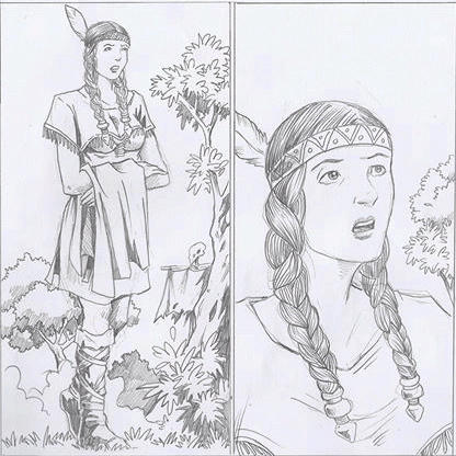
We might mix up the release order, so there is no way to tell which tale will come out first. but for now we are calling this one number four. It takes place in North America, in the 1800’s. Here are a couple of panels from page two.

We are also actively looking for spec scripts for this series. If you are interested in maybe seeing something you wrote in print, give me a shout. We will explain everything you need to know and see if we can do something together. Cheers!

Dec 112018
 

So much has been happening, and so little. So far the Kickstarter for Sissonne failed to fund, and the soft release for Lazurus’s Eye was a disappointment. The official release has done a bit better, but more on that later. The thing to know is that we plan to have a series of Kickstarters after the New Year, and of course one of those will be for Spook Town. 

So far we have the artwork for FOUR issues completed, and three of those four lettered. That’s huge. The only reason we don’t have even more is because of the backlog in stuff getting Kickstarted. Still, here is the best update I can give you at the moment for Spook Town. 

The Ever Evolving Logo

I got tired of two things pretty quick while hiring people to make a logo for me. One was the cost, the other thing, quite frankly, were the logos themselves. Uninspired, nipples missing…just turrible. So we’ve had some work on and off on the logo for Spook Town. At first we decided in a seaside font, for it’s 1940’s feel, but then later decided to add some imagery/design to make it pop out a bit against the rest of the line art on the mostly black and white covers we plan to keep using. 

And here it is on the first couple of covers, both by JC Grande.

Writer David Thomas is still busy working on new scripts for this ongoing series. We really, really have high hopes for this one. The concept is just brilliant and we can see that it should have a very good chance, given some good word of mouth, to reach a large audience. Time will tell.


Feel free to let us know what you think of the logo, or the covers.